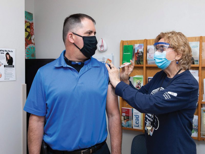
New tool tracks COVID cases in school districts
Cornell University’s ILR School recently launched the NYS School District COVID-19 Tracker, which allows users to check COVID-19 case numbers within the geographic boundaries of school districts in addition to socioeconomic and demographic variables.
The tool (https://t.ly/mdZ2) is a web-based, interactive mapping application that combines multiple sources of data on COVID-19 to show current estimates of active and cumulative coronavirus cases per 1,000 residents living within a school district.
Its developer, Russell Weaver, director of research for ILR’s Buffalo Co-Lab, said the tool helps users plan ahead when traveling through or living in certain school districts, and he sees it as beneficial to residents in Tompkins County and beyond.
Weaver said the inspiration for the tool started months ago when the pandemic hit the Buffalo Co-Lab.
“Our outreach team for the ILR School put together this committee of folks from all across the state from ILR and basically tasked us with figuring out ways to pool our resources and work together to inform the public during the pandemic, to create whatever we could to support any sort of planning or decision-making efforts that needed to happen in relatively real time,” he said.
Weaver became part of that effort around mid-July, when many people’s focus was on schools reopening.
“I am a stats nerd by admission, and so, I calculated the probability that by chance alone, if I sent my son back to school, that he would encounter somebody with COVID,” he said. “And so, when I was telling that story, the rest of the committee asked, ‘What if we could do something like that for all of New York state?’ And so, that was the origin of the project.”
He and his team decided to collect as much data as possible on cases at the county level to estimate the conditions within school districts. Then, they looked to various outside partners to ask for input on improvements, which led to the inclusion of more variables like demographic information, helping to account for the most vulnerable groups.
Originally, the idea was to canvas, district by district, the plans that were coming out for schools reopening and cross-analyze that with demographic and case-level data to estimate how soon a district may be able to implement its plans and reopen.
“Once we realized that that was going to be a bit too intensive and that it was hard for us to get consistent information across every district, we abandoned that idea and then went into this — I guess version two of, well, let’s just assemble all the data that we can and put it in one place so that way, if people are out there trying to make decisions, … we could just try to centralize that and put it into one location,” Weaver said.
The team had a draft of the app ready in early August, where it then went into demo sessions for the New York State Council of School Superintendents, the New York State PTA and state senators involved in education policy. This led to additional improvements, like including a layer that, if enabled, allows a user to click on a school district and get all the real-time COVID-19 information being put out by that school district.
After more changes and support from partners, the tool was finally able to launch earlier this month. Weaver said that while there are other resources for people to use to track COVID-19 cases — and he encourages folks to use those as well — his tool provides something different those tools don’t.
“The real-time data that does come out on COVID cases is provided for counties. And that’s great — it’s super useful to have that information — but it’s hard for us as residents or stakeholders to understand what’s going on in their community, in their own backyard,” he said.
And while some resources, like the state’s COVID-19 Report Card webpage, allow users to see reported cases by school, that doesn’t include all cases within each district.
“Presumably, students have to go home,” Weaver said. “They might, even though it’s not advised, be going to friends’ houses or anything else. And so, recognizing that schools are able to control the situation a little bit better than outside of schools, we want to provide the full geographic context.”
Another significant difference Weaver said users should keep in mind is that the COVID-19 cases within each school district are estimates, not exact, real-time numbers.
The estimation technique is called population-weighted aerial interpolation, which uses data from three main sources — the CDC’s social vulnerability index and the Environmental Protection Agency’s respiratory health hazard index and air quality index — to best estimate COVID-19 cases.
“Using those three distributions, we rely on the statistical estimation technique to sort of take what’s happening at the county level and break it down into individual spaces inside of the county based on where these underlying risk factors are found,” Weaver said.
The tool is meant to help people make informed decisions related to travel and school, like helping a parent decide whether to send their student to in-person classes, helping a school administrator decide what sorts of preventative measures or even shutdowns might be needed. Even people without students, like those going out of town to a store, for example, can benefit from the comparative analysis the tool offers, Weaver said.
Tompkins County Public Health Director Frank Kruppa spoke to its usefulness for county residents.
“There’s obviously interest in how COVID is happening within schools,” he said. “And I think it’s one location where if you have connections with multiple districts, you’d be able to check quickly, versus having to go to different school district websites or even the state’s website. So, I think it’s just an added benefit for folks.”
While the tool is useful, Weaver said it’s not perfect yet. For starters, it’s challenging just to maintain it.
“I’m the person on our team that did the development, that built the infrastructure in the tool and did the data collection, and so far, I’m the only person who’s been able to do the updating,” Weaver said. “And so, just trying to manage that with other projects that we have going on presents a bit of a challenge. But we’ve got it down to a pretty good science at this point.”
Weaver is also hoping to improve the tool by making certain features smoother and providing a public feedback option. He’d also like it to be a bit more intuitive, as right now, the best way for a user to understand how to use the tool is by watching a YouTube tutorial the team created for it.
For now, the tool serves as another resource to help people be better informed about COVID-19, which Kruppa said is a worthy effort.
“I’m thankful that Cornell took the steps to create this tool for our community to have additional data points,” he said. “If folks find it useful, that’s great. And we appreciate everyone that’s helping us try to get information out about how COVID is affecting our community.”